以前也总结过一篇 CSS 居中,但是感觉那一篇结构有点乱,上面的这篇文章的结构和思路比较清楚,记录一下。
水平居中
对于 inline 属性的元素
让一个块级父元素包裹它,然后设置 text-align:center。
1 | .center-children { |
对于 inline 属性的元素如 inline, inline-block, inline-table, inline-flex 是有效的。
对于块级元素
赋予它 margin-left:auto 和 margin-right:auto 使其居中(它必须有确定的 width ,否则它将是全宽度不需要居中)。
1 | .center-me { |
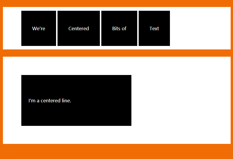
对于多个块级元素
如果想让多个块级元素在一行居中,最好是改变它们的 display 为 inline-block ,或者使用 flexbox。
1 | .inline-block-center { |
1 | .flex-center { |
如果想让多个块级元素在一列居中,margin:0 auto 依然有效。
1 | main div { |
垂直居中
对于 inline 属性的元素
单行
对于标签来说,如 a 标签,包裹它的父元素的 padding-top 和 padding-bottom 相等就可以使它垂直居中。
1 | .link { |
对于单行文本来说,让 height 和 line-height 相等即可。
1 | .center-text-trick { |
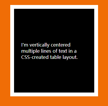
多行
使用 table 标签或者让它类似 table 的表现形式(借助 vertical-align)。
1 | .center-table { |
或者使用 flexbox。
1 | .flex-center-vertically { |
对于块级元素
已知元素高度
1 | .parent { |
未知元素高度
1 | .parent { |
不介意增加父元素高度
Using tables or CSS display to make elements into tables
1 | main { |
使用 flexbox
1 | .parent { |
水平垂直居中
已知元素宽高
1 | .parent { |
未知元素宽高
1 | .parent { |
使用 flexbox
1 | .parent { |
使用 grid
This is just a little trick that will pretty much work for one element:
1 | body, html { |